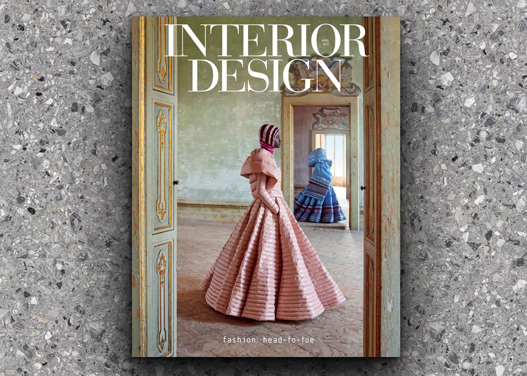
Interior Design April 2019
Fashion: Head-to-toe
Clicks into Bricks, Online retailer By brings its edgy attitude to a Shanghai store by Spacemen
Millennials may prefer online shopping. “With the rise of giants like Alibaba, Taobao, and WeChat, a lot of retailers in China are converting to e-commerce,” architect Edward Tan concedes. But there’s a concurrent movement toward brick-and-mortar establishments, he adds: “Some online retailers are doing the exact opposite by building large experience stores. Customers go off-line to explore activation spaces that are fun, further boosting brand awareness.”
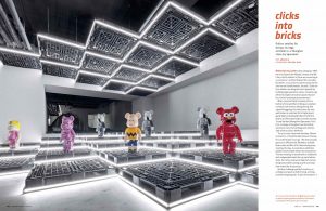
When a mutual friend introduced Tan to fashion aficionado Warren Wang, an engineer turned private investor, Wang already had a good thing going. His online store, By, was well-known as a pioneer for bringing avant-garde labels that include Neil Barrett and Rick Owens to China’s booming e-commerce arena. To seal the deal, Wang hired Spacemen, Tan’s firm, to design a Shanghai store for By that would also carry the handbags and watches sold online at sister site Moore.
“As an in-store visual merchandizer, Warren is eccentric—I think that also shows in the way he runs the brand,” Tan says. “He never actually gave us an official brief. We had to scribble down notes and bits of his ideas during every meeting. One day, it would be an exhibition platform with limited-edition furniture pieces. The next meeting, he would want to collaborate with independent labels for a private fashion show. Part of our job was to help him narrow things down while coming up with a concept that worked for all scenarios.”
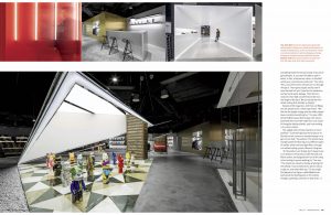
Another challenge was By’s location, an underground space at Soho Fuxing, a dining-oriented shopping mall. “A pair of escalators completely hides the entrance to By. If you don’t go looking for it, you won’t be able to spot it—which, in fact, attracted our client, as he didn’t see By as a conventional retail store,” Tan notes. “Also, a lot of the mall’s mechanicals run through the space. The exposed pipes and ductwork near the back left just 7-plus feet for headroom, and we found water leakage. Then there’s a massive 4-foot-high concrete block that runs the length of the back. We converted that into tiered seating that doubles as display.”
Despite all the negatives, both Tan and Wang saw the potential for a retail experiment. “We felt that the height change and the oddly shaped layout could be something fun,” Tan says. With almost 8,800 square feet to play with, he programmed the front of the sales floor as a cluster of triangular display islands, each surrounding a structural column.
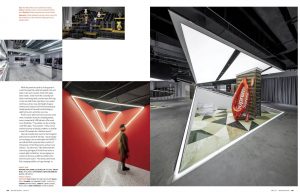
The angled sides of these islands are mirror polished. “Customers glimpse the products reflected and are curious to meander deeper in to get a closer look,” he explains. The islands have triangle-patterned flooring in six different types of marble, while overhead light filters through a stretched ceiling system, likewise triangular.

